
How to build Power BI dashboards people actually open
A dashboard nobody looks at is an expensive screensaver. Here is how we design reports leadership uses daily.
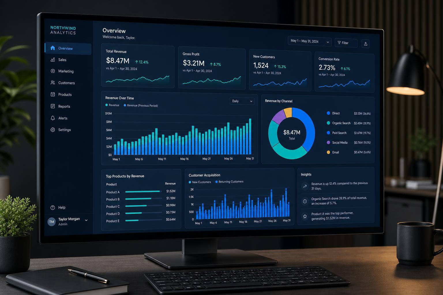
Most organisations do not have a reporting problem. They have a "too many reports" problem.
Start from a decision, not a dataset
Ask what decision the report should support this week. "Which jobs are at risk of missing their deadline?" is a decision. "Operational overview" is not.
One screen, five numbers
If a dashboard needs scrolling to make its point, it is doing too much. Lead with the handful of measures that change behaviour and put the detail one click away.
Trustworthy beats clever
A plain table that reconciles to the finance system will be used. A beautiful visual that is 2% out will be quietly abandoned. Document your measures and show the refresh time on every page.
Make it a habit
Schedule refreshes before the working day starts, and send a short subscription email that pulls people back in. Adoption is a design problem as much as a data problem.
Got a system that's holding you back?
Tell us what you're trying to achieve — we reply within one working day.
Start a conversation